Monitoring Dashboard Guide
Monitoring Dashboard Guide
The krkn_ai monitor command launches a Streamlit-based interactive dashboard that lets you inspect experiment results, either as a live view during an active run or as a post-run analysis tool once the experiment has completed.
Overview
Krkn-AI stores results in a structured output directory after every run. The monitoring dashboard reads those files and presents them through a browser-based UI built with Streamlit. All charts are interactive (powered by Plotly) and the dashboard auto-refreshes while a run is in progress.
Viewing Results During a Live Run
To launch the dashboard alongside an active experiment, pass the --monitoring flag to krkn_ai run:
uv run krkn_ai run \
  -c ./krkn-ai.yaml \
  -o ./results/ \
  --monitoring
This starts the dashboard as a background process pointing at the run’s output directory. By default it listens on port 8501. Open your browser at:
http://localhost:8501
To change the port:
uv run krkn_ai run \
  -c ./krkn-ai.yaml \
  -o ./results/ \
  --monitoring --port 9000
Note: The dashboard process continues running even after the experiment finishes. A message like
"Run finished. Monitoring dashboard will remain running. Terminate manually when done."is logged. You must stop it manually (e.g., with Ctrl+C or by killing the process).
While the run is in progress the sidebar displays “Execution in progress…” and the dashboard polls for new data every 3 seconds, so charts update automatically as each generation completes.
Viewing Results After a Completed Run
Use the standalone monitor sub-command to open the dashboard against a previously saved results directory:
uv run krkn_ai monitor -o ./results/
Flag Reference
| Flag | Short | Default | Description |
|---|---|---|---|
--output | -o | ./ | Path to the directory that contains the run results (the parent folder holding UUID-named sub-directories, or a specific run UUID directory). |
--port | -p | 8501 | TCP port on which the Streamlit server will listen. |
--help | Print usage and exit. |
Examples:
# View latest results from the default output directory
uv run krkn_ai monitor -o ./results/

# Use a specific port
uv run krkn_ai monitor -o ./results/ -p 9090

# Point directly at a specific run UUID directory
uv run krkn_ai monitor -o ./results/3f8a1c2d-9b4e-4f1a-8c7d-1234567890ab
Note
When-o points to a parent directory (e.g., ./results/) the dashboard automatically discovers all UUID-named sub-directories and lets you switch between runs from the sidebar. When -o points directly to a single run directory the sidebar run-selector is hidden.Understanding the Output Directory Layout
Each krkn_ai run invocation creates a subdirectory named by its UUID inside --output:
results/
└── <run-uuid>/
    ├── run.log                   # Full execution log
    ├── results.json              # Machine-readable run status
    ├── krkn-ai.yaml              # Config snapshot used for this run
    ├── dashboard.log             # Dashboard server log (if --monitoring used)
    ├── reports/
    │   ├── all.csv               # Scenario-level results (main data source)
    │   ├── health_check_report.csv
    │   ├── best_scenarios.yaml
    │   └── graphs/
    │       ├── best_generation.png
    │       └── scenario_N.png
    ├── yaml/
    │   └── generation_N/
    │       └── scenario_N.yaml
    └── logs/
        └── scenario_N.log
The dashboard reads reports/all.csv, reports/health_check_report.csv, and the per-scenario YAML telemetry files. results.json is used to determine run status (started / in-progress / completed / failed).
Visualisation Layer Walkthrough
The dashboard is divided into a sidebar (controls and global filters) and seven tabs covering different aspects of the experiment.
Sidebar
Run Selector: appears only when the output directory contains multiple UUID runs. Results are sorted by last-modified time (newest first).
Status indicator: reflects the value in results.json:
- “Execution in progress…” - run is active; dashboard auto-refreshes every 3 s.
- “Execution completed!” - run finished successfully.
- “Execution failed!” - run terminated with an error.
- “Execution status unknown.” - status could not be read.
Global Filters: applied consistently across all tabs:
- Filter by Generation - show only the selected generation numbers.
- Filter by Scenario Name - filter by scenario type (e.g.,
pod-scenarios). - Filter by Scenario Number - filter by numeric scenario IDs.
- Filter by Service - filter health-check and detailed telemetry by service/component name.
Best Iterations Scope: further narrows the results dataset:
- Top K scenarios by above score - keep only the top-K rows by the selected score column.
- Top P(%) scenarios by above score - keep only the top P percent of rows.
Export Report: generates a self-contained HTML report from the current view (respects all active filters). Click Download Report to save it locally.
Dashboard
The Dashboard tab shows a high-level experiment summary.
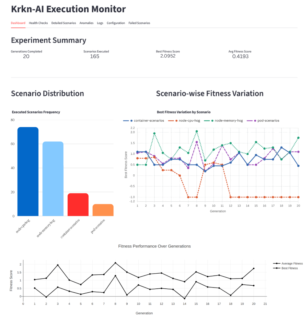
| Panel | Description |
|---|---|
| Experiment Summary | Four metric cards: generations completed, total scenarios executed, best fitness score, and average fitness score. |
| Fitness Score Evolution | Line chart with two series: Best Fitness and Average Fitness per generation. Hover for exact values. |
| Scenario Distribution | Histogram showing how often each chaos scenario type was executed across all generations. |
| Scenario-wise Fitness Variation | Per-scenario line chart of best fitness across generations. Useful for identifying which scenario type consistently achieves high fitness. |
| Generation & Scenario Details | Sortable table of all executed scenarios (generation, scenario ID/name, duration, individual score components, fitness). A generation dropdown lets you drill into a specific generation. |
| Score Delta vs Baseline | Grouped bar chart showing the delta of each score component (fitness, health check failure, health check response time, krkn failure) relative to the baseline scenario. Bars above zero indicate improvement over baseline. |
| Fitness Improvement Trend vs Baseline | Area/line chart showing per-generation best and average fitness as a percentage improvement over the baseline. Positive values mean the evolved scenarios are better than running with no chaos. |
Health Checks
The Health Checks tab visualises service availability and latency during chaos experiments.
| Panel | Description |
|---|---|
| Latency Heatmap | Matrix of Scenario ID × Component coloured by the selected latency metric (average_response_time, max_response_time, or min_response_time). Darker/redder cells mean higher latency. |
| Scenario Trends | Grouped bar chart showing the chosen latency metric per scenario, with bars grouped by service/component. Identifies which scenarios stress which services most. |
| Success vs Failure | Stacked bar chart of cumulative success_count and failure_count per component across all scenarios. Reveals which services are most fragile under chaos. |
| Resilience Radar | Polar/radar chart plotting a resilience score (1 / response_time) per component, coloured by scenario. Components whose polygon arms extend further are more responsive. |
| Response Range Plot | Line-and-marker chart showing the min-to-max latency range per component. Wide ranges indicate high variability. |
| Components Table | Tabular view of all health-check data, sortable by any metric. Use Top K Worst Performing Components to focus on the slowest or most failure-prone services. |
Data source: reports/health_check_report.csv
Detailed Scenarios
The Detailed Scenarios tab displays per-scenario YAML telemetry (service-level response times, request counts, and error rates) collected during each chaos run. Use it to understand the fine-grained impact of a specific scenario on individual services.
Data source: per-scenario YAML files under yaml/generation_N/.
Anomalies
The Anomalies tab runs automated anomaly detection across all experiment data and surfaces unusual behaviour that warrants investigation.
Detection Modes
| Mode | How it works |
|---|---|
| Z-Score (default) | Flags data points whose Z-score (x − μ) / σ exceeds a configurable threshold. ` |
| % Deviation | Compares each value to the baseline scenario. ` |
Detectors
| Detector | Anomaly Type Label | Triggered when… |
|---|---|---|
| Fitness IQR | Low Fitness (IQR) / High Fitness (IQR) | Fitness score breaches IQR fences or falls below the baseline fitness. |
| Duration | Duration (Execution Time) Anomaly (Z-score) | Scenario duration deviates from the baseline/mean duration. |
| HC Failure Surge | Health Check Failure Surge | health_check_failure_score breaches the IQR upper fence or deviates ≥ 30% from baseline. |
| Fitness Regression | Fitness Regression | Best fitness drops from one generation to the next (> 20% drop → High, > 10% → Medium). |
| Service Failure Spike | Service Failure Rate Spike | Per-service failure rate is a Z-score outlier or deviates ≥ 30% from baseline. |
| Krkn Failure Score | Krkn Failure Score Spike | krkn_failure_score > 0 (non-zero = krkn engine error). Above IQR upper fence → High. |
| HC Response Time | Health Check Response Time (Latency) Anomaly | health_check_response_time_score exceeds the IQR upper fence and/or Z-score threshold. |
| Service RT Spike | Service Response Time (Latency) Spike | Per-service mean response time is a Z-score outlier or deviates ≥ 30% from baseline. |
Anomaly Map
The bubble scatter chart plots Anomaly Type (X-axis) against Scenario (Y-axis). Each bubble represents one detected anomaly:
- Size →
|z-score|in Z-Score mode, or|% deviation from baseline|in % Deviation mode
Anomaly Summary Metrics
| Metric | Description |
|---|---|
| Total Anomalies | Total anomaly events detected. |
| High Severity | Count of High severity anomalies. |
| Medium Severity | Count of Medium severity anomalies. |
| Low Severity | Count of Low severity anomalies. |
| Anomaly Types | Distinct anomaly categories triggered. |
Detected Anomalies Table
Every anomaly record is shown with: scenario_id, scenario, generation, anomaly_type, value, threshold, baseline_ref, z_score, severity, and detail. Use the Filter by Severity and Filter by Anomaly Type multi-selects to narrow results.
Logs
The Logs tab streams scenario execution logs from the logs/ subdirectory. Use the scenario dropdown to navigate between individual scenario log files.
Configuration
The Configuration tab renders the krkn-ai.yaml configuration snapshot used for the selected run, for auditing which scenarios, fitness functions, and health-check endpoints were active.
Failed Scenarios
The Failed Scenarios tab shows scenarios where krkn_failure_score < 0 (krkn engine misconfiguration or internal failure). The layout mirrors the Generation & Scenario Details table in Tab 1.
Exporting a Report
Click Generate HTML Report in the sidebar to generate a self-contained HTML file of the current view. After the spinner completes, click Download Report to save the file.
Configuring Anomaly Detection Thresholds
Thresholds are read from krkn_ai/dashboard/anomaly_config.yaml:
iqr_k: 1.5

severity:
  high_z: 2.5
  medium_z: 1.5
  high_pct: 60.0
  medium_pct: 30.0

duration:
  z_threshold: 1.5
  baseline_pct: 30.0

hc_failure:
  baseline_pct: 30.0

hc_response_time:
  z_threshold: 1.5
  baseline_pct: 30.0

service_response_time:
  z_threshold: 1.5
  baseline_pct: 30.0

fitness_regression:
  high_drop_pct: 20.0
  medium_drop_pct: 10.0
  z_div: 10.0
Edit this file and restart the dashboard to apply new thresholds.
Troubleshooting
| Symptom | Likely Cause | Resolution |
|---|---|---|
| “No recognised data files were found” | Wrong output directory | Pass the correct -o path; ensure results.json exists. |
"reports/all.csv exists but is empty" | No scenario has completed yet | Wait for the first generation to finish. |
| Charts empty but status shows “Execution completed” | Filters are too narrow | Clear all sidebar filters. |
| Port already in use | Another Streamlit process is running | Use -p <other-port>. |
| Dashboard does not auto-refresh | Browser tab was backgrounded | Bring the tab to the foreground. |